I’m losing faith in Iroshizuku…

Tags

, , , , , ,

20130212-091839.jpg

That’s Iroshizuku Fuyu-gaki on Rhodia 80 g. paper. This is my fifth Iroshizuku ink review and I’ve been entirely disappointed with four of them. The fifth, which I liked enough to buy despite its quirks, is Ku-jaku.

Someone talk me out of hating this ridiculously poorly behaved ink that goes for $0.56 per milliliter. I won’t judge the entire line on the five I’ve tried, but I’m not wasting any more money on any more of this brand.

Working on Gothic Letters

Tags

, , , , , , , , , , , , , , , , , , , , , , , ,

I’ve been trying to get semi-proficient with several italic scripts, as so far I’ve only been comfortable with flexed writing. So why not mix the two?

20130208-185353.jpg

Diamine Beau Blue

Tags

, , , , , , , , , , , , , , , , , , , ,

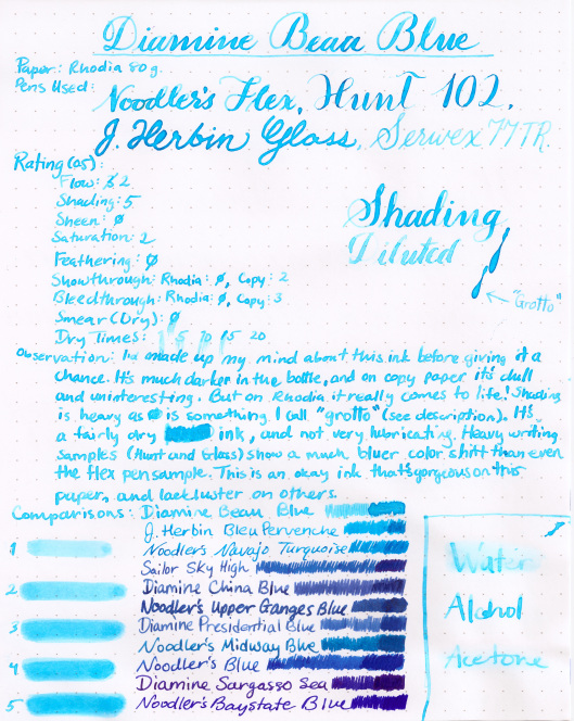
Here’s my review of Diamine Beau Blue, an ink which I’d not given a fair chance and had already made up my mind to hate. But fortunately those feelings changed when I saw that icy blue goodness being laid down on Rhodia. And also, as you might notice, I’ve made up a completely superfluous term to go along with my reviews to describe a VERY desirable (for me) trait of inks that I call…

Grotto

Diamine Beau Blue (Medium)

And onto the new term: Grotto.

I first noticed this trait in Herbin inks. In fact, if you look at some of my previous reviews I make several references to the “‘Herbin’ look”. It’s the beautiful darker-on-the-edges look that many J. Herbin inks can achieve when they dry on quality paper, and is especially prominent in nibs that are wet, bold, or flexy. I’d never had a name for it, but when reviewing this ink I found this particular quality so striking that I felt I had to name it.

To me it is a very “wet” look, like coffee that’s dried on non-absorbent paper. But I couldn’t call it “wetness” because people would think it just never dries (and what I call a “wet” look may very well trigger something completely different when someone else see’s it). So I ran with the word “wet” without actually using it, and after some thinking I decided I shall call this ink characteristic—at least within the context of future reviews—”grotto”. Grottos are mysterious, often beautiful places that might be harboring secrets. Their walls are often wet, and the water that might come from a natural spring and form a pool in them is clear and cool, straight from nature.

So now that I’ve gotten all the poetic junk out of the way, that’s “grotto”. This ink has great grotto. Not that I expect anyone else to pick up the word (though I’ll be perfectly happy if they do); it’s just a word to describe something I’ve been trying to describe for a long time.

And here are some other inks that have great grotto.
DiamineBeauBlueGrotto

Three Great Copy Paper Blues

Tags

, , , , , , , , , , , , , , , , , , , , , , , , , , , , , , , , ,

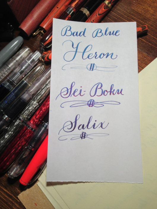
Here are my three favorite blues for when I’m writing on less-than-ideal paper.

Otherwise good behaving, heavily-shading and/or sheening inks more often than not are rendered by bad paper into flat, feathering, bleedthrough-prone monstrosities.

But not these three inks. Shading is heavy on all three and bleedthrough isn’t an issue at all.

Noodler’s Bad Blue Heron: A part if Noodler’s Warden Series, their most fraud resistant inks currently produced. Feathering sent a problem and shading is heavy. There’s even a tad of the ink’s subtle sheen.

Sailor Sei-Boku: This ink is one of the only pigmented inks on the market that’s truly safe for regular use in fountain pens. On copy paper its behavior couldn’t be better. Shading and sheen are prominent. The sheen is especially striking considering the absorbency of the paper.

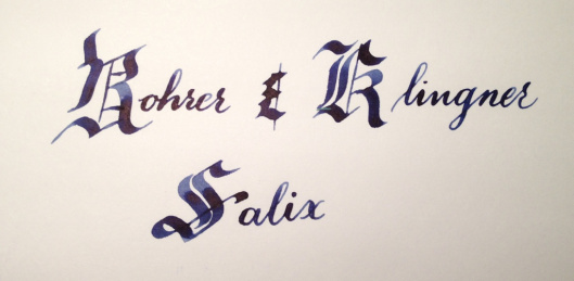
Rohrer & Klingner Salix: This is an iron gall ink, a category of ink that is known for its good behavior on a wide variety of paper.

You won’t regret trying any of these fantastic inks.

20130129-090412.jpg

Iroshizuku Ku-jaku

Tags

, , , , , , , , , , , , , , , , , , , , , , , , ,

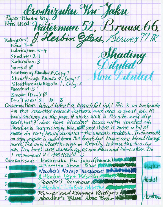
Here’s a gorgeous ink from Iroshizuku. It’s not exactly a class act on copy paper, but on Rhodia and other quality papers it’s a stunning color.

Iroshizuku Ku-Jaku (Medium)

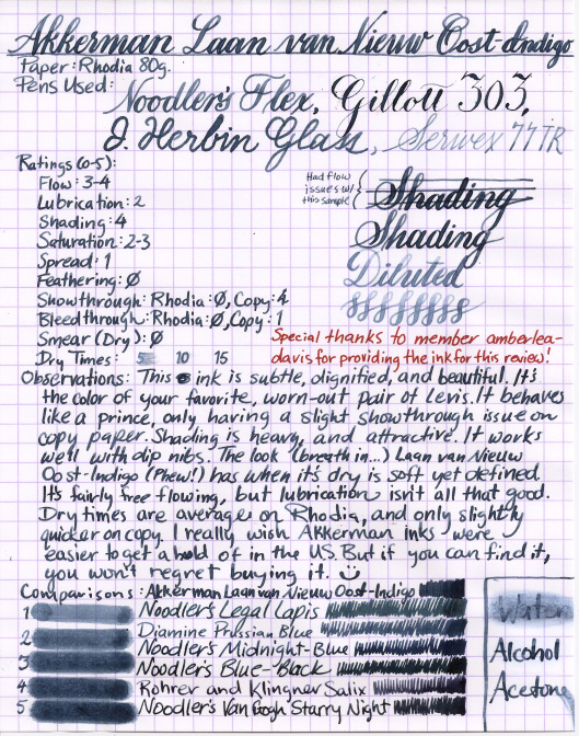
Akkerman Laan van Nieuw Oost Indigo

Tags

, , , , , , , , , , , , , , , , , , , , ,

This is an ink with one crazy long name, but luckily it’s good enough to justify it. There’s some serious discussion about whether or not Akkerman inks are simply re-bottled Diamine inks. I haven’t seen anything to convince be either way, but I will say that this ink is VERY similar to its supposed analog, Diamine Prussian Blue (which, coincidentally, I also love).

Akkerman Laan van Nieuw Oost Indigo (Medium)

Follow

Get every new post delivered to your Inbox.

Join 273 other followers